
Client: Terp Taffy
Project: Packaging for single-serving
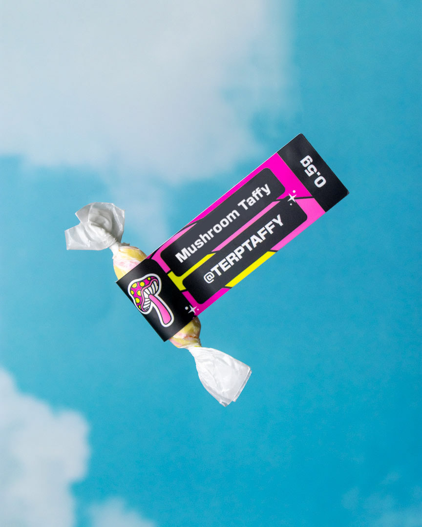
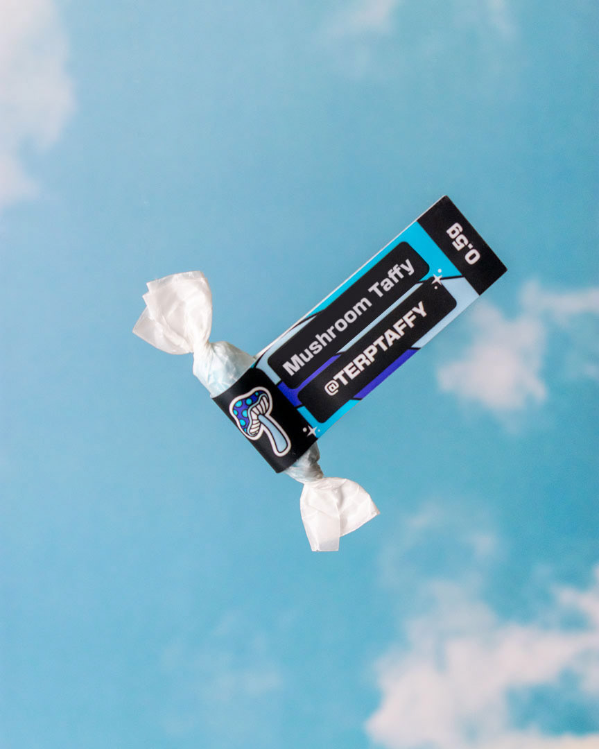
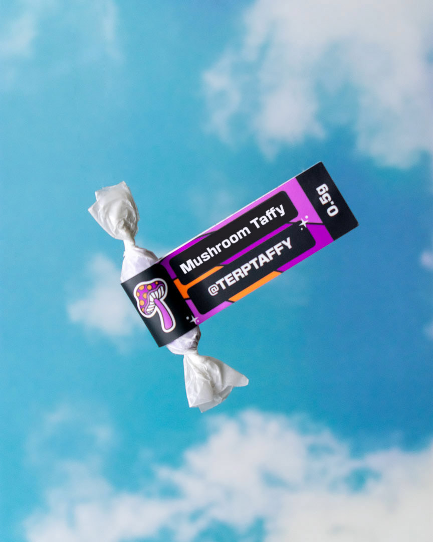
Objective: Create a flag-style sticker design for single-serving taffy packaging, maintaining brand consistency while optimizing legibility at a smaller scale.
Terp Taffy approached me with the need for a packaging solution that allowed them to sell individual servings of their taffy while maintaining their established brand identity. While they already had bulk packaging in place, they wanted a flag-style sticker that would clearly display key product details—flavor, quantity, company name, and the type of mushroom used.
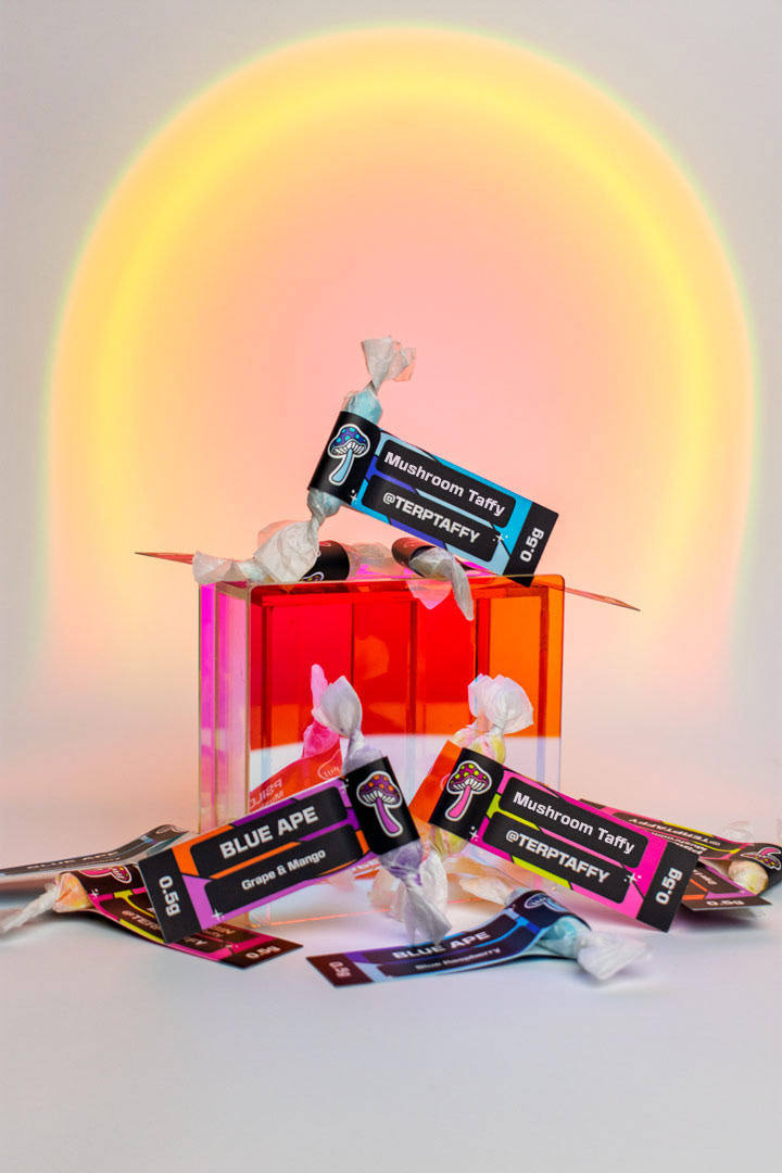
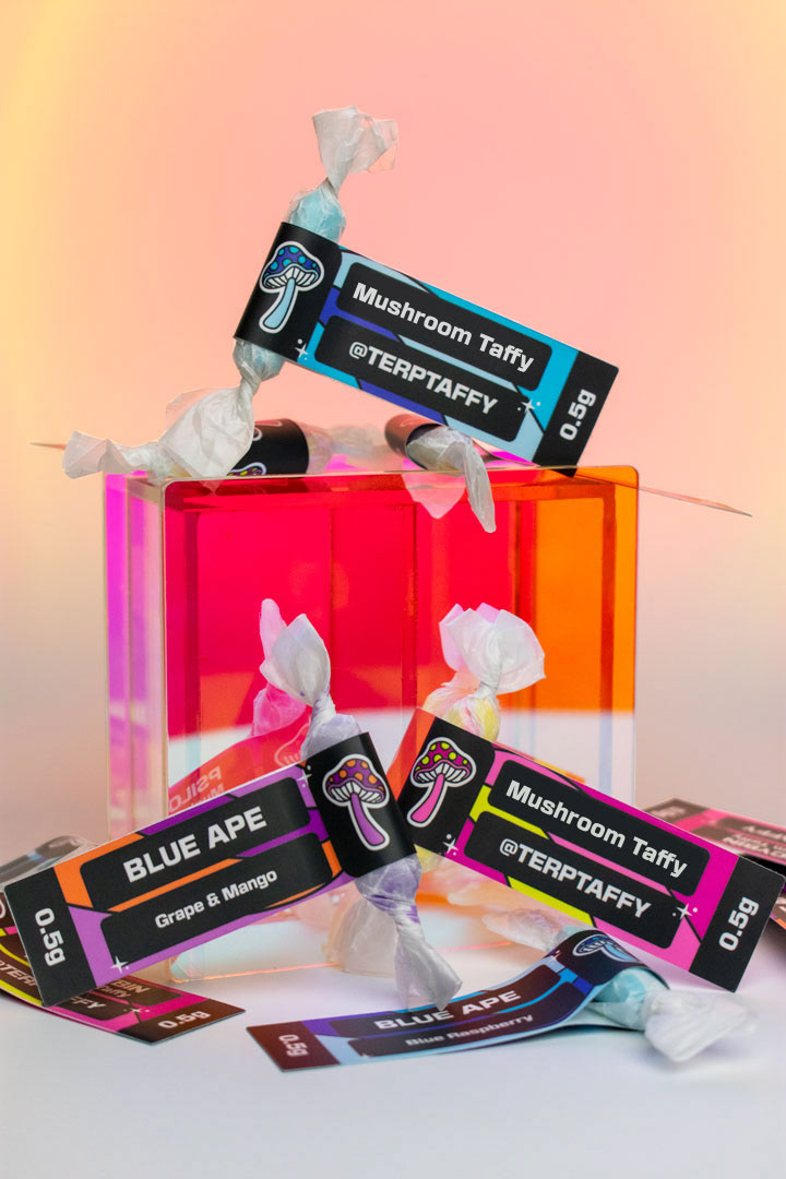
To ensure brand cohesion, I pulled design elements from their existing pouch packaging, creating a visual connection for their returning customers. The typography was refined to enhance legibility at a reduced scale while preserving the playful aesthetic of the brand. The final sticker design strikes a balance between clarity, functionality, and brand identity, allowing Terpy Taffy to expand their product offering while maintaining a strong visual presence.